Visual language / Chapter 08
Sprites, colours and graphical limitations
Early computers could draw very little. That is precisely why their games acquired vivid colours, angular figures and ingenious tricks that remain instantly recognisable.
01 / Constraint as a tool
Why old games look the way they do
Large pixels were only part of the difference. Behind every image stood a stack of rules about memory, colour and timing.
A modern computer can store extensive colour information for every point on the screen. An early-1980s home computer simply had no room for that. Working memory was scarce, processors were slow and video chips could handle only a limited number of colours or moving objects.
Designers therefore had to keep choosing. Which parts of the screen should move? Which colours may sit next to each other? Can the main character consist of a single colour? And what happens when five enemies appear at the same height while the video chip can manage only four?
Those questions shaped a game's appearance before the artist placed the first pixel. Each machine imposed a grammar: eight-by-eight blocks, reusable patterns, hard colour contrasts and figures made from exactly enough dots to be recognised.
02 / A screen made of cells
Pixels, characters and tiles
Many early computers did not think in terms of a completely free canvas, but in a grid of reusable building blocks.
Text screens were efficient because the computer did not have to store every letter as a separate image. A number in screen memory pointed to a character pattern: perhaps the letter A, a line segment or a PETSCII symbol. Programmers soon discovered that these characters could also represent walls, roads, playing cards or parts of a spaceship.
Even when a machine offered a true bitmap mode, working in tiles remained attractive. An eight-by-eight-pixel pattern could be repeated dozens of times without being stored again. Backgrounds consequently developed a visible rhythm: bricks, ladders, platforms and star fields aligned to an invisible grid.
03 / Colour is memory
Sixteen colours, endless choices
A small palette did not automatically produce a colourless image. It mainly forced artists to choose with purpose.
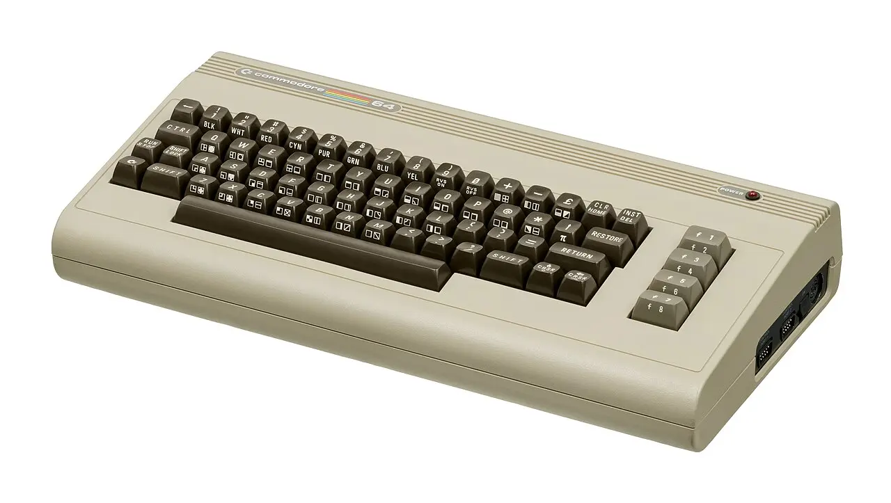
The Commodore 64 had a palette of sixteen colours. That sounds meagre, yet its tones were useful for shadow, skin, sky and earth. Artists combined dark and light variants to suggest depth. Dithering—a chequerboard of two colours—could even persuade the eye to perceive a third shade.
The precise options depended on the display mode. In multicolour bitmap mode, four colours could be used inside an eight-by-eight-pixel cell, but the horizontal pixels became twice as wide. More colour therefore meant less detail. Graphic design was a continuous trade: sharpness for colour, freedom for memory.
04 / Two colours per cell
The ZX Spectrum and attribute clash
Its display was sharp, but colour was assigned in blocks of eight by eight pixels.
The ZX Spectrum drew a bitmap of 256 by 192 pixels, but stored colour information separately. Every eight-by-eight-pixel cell received one foreground colour—ink—and one background colour—paper. Brightness and flashing applied to the whole cell as well.
When a coloured figure moved across a background of another colour, the two could not always retain their individual colours. An entire cell would temporarily jump to a different combination. This became known as attribute clash. Designers concealed it with black backgrounds, narrow corridors, monochrome playfields or movement aligned to cell boundaries.
What began as a technical shortcoming became a visual signature. Spectrum games are often bright, high-contrast and graphically bold. A single screen can be enough to identify the machine.
05 / Figures free to move
What a sprite really was
A hardware sprite was like a transparent card placed above or below the background, moving without the computer redrawing the entire screen.
The Commodore 64's VIC-II chip directly supported eight sprites. A single-colour sprite measured 24 by 21 pixels; multicolour mode halved the horizontal resolution. Each sprite had its own position and colour, could be enlarged and could report collisions with other sprites or the background.
Eight looked like a hard limit until programmers began following the video scan precisely. Once a sprite near the top was no longer needed, the same hardware channel could receive new coordinates and a new pattern lower down. This sprite multiplexing made far more than eight figures appear visible—as long as they were distributed intelligently down the screen.
The trick required exact timing. A late update produced flicker or mangled shapes. It was this contest between fixed hardware and inventive software that made the best 8-bit games so impressive.
06 / The fifth one disappears
MSX and the single-scanline limit
First-generation MSX machines could define 32 sprites, yet display no more than four of them on the same horizontal line.
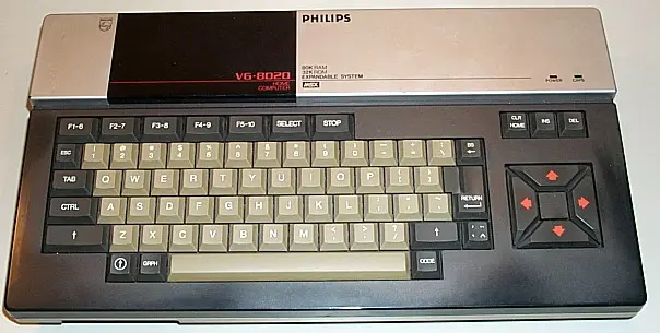
The video chip maintained a list of up to 32 sprites. As soon as it encountered the fifth sprite while drawing a line, that sprite was no longer displayed normally. An enemy or bullet could therefore vanish in a crowded action scene.
Programmers spread objects across different heights, changed the order of the sprite list or alternately left figures out. The last method caused the familiar flicker in crowded scenes. It was not careless artwork but an emergency measure, suggesting more moving objects than the chip could handle on one line.
07 / Draw faster than the television
Atari 2600 and ‘racing the beam’
The Atari did not store a complete picture. During every scanline, its processor had to tell the video chip what should appear on the television.
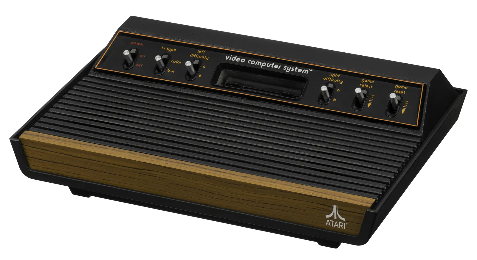
The TIA video chip offered two narrow player graphics, two missiles, a ball and a symmetrical playfield. This was far too little for the worlds programmers wanted to build. Timing provided the escape: registers could be changed while the electron beam constructed the screen line by line.
An object could change colour or form halfway down the picture. The playfield could alter between bands. A programmer was effectively writing not only what should be drawn, but the exact moment at which it should happen. The most famous Atari images emerged from a collaboration between code and television.
08 / Without colour
The Macintosh chose sharp black and white
While other computers advertised colour, the original Macintosh used one bit per pixel.
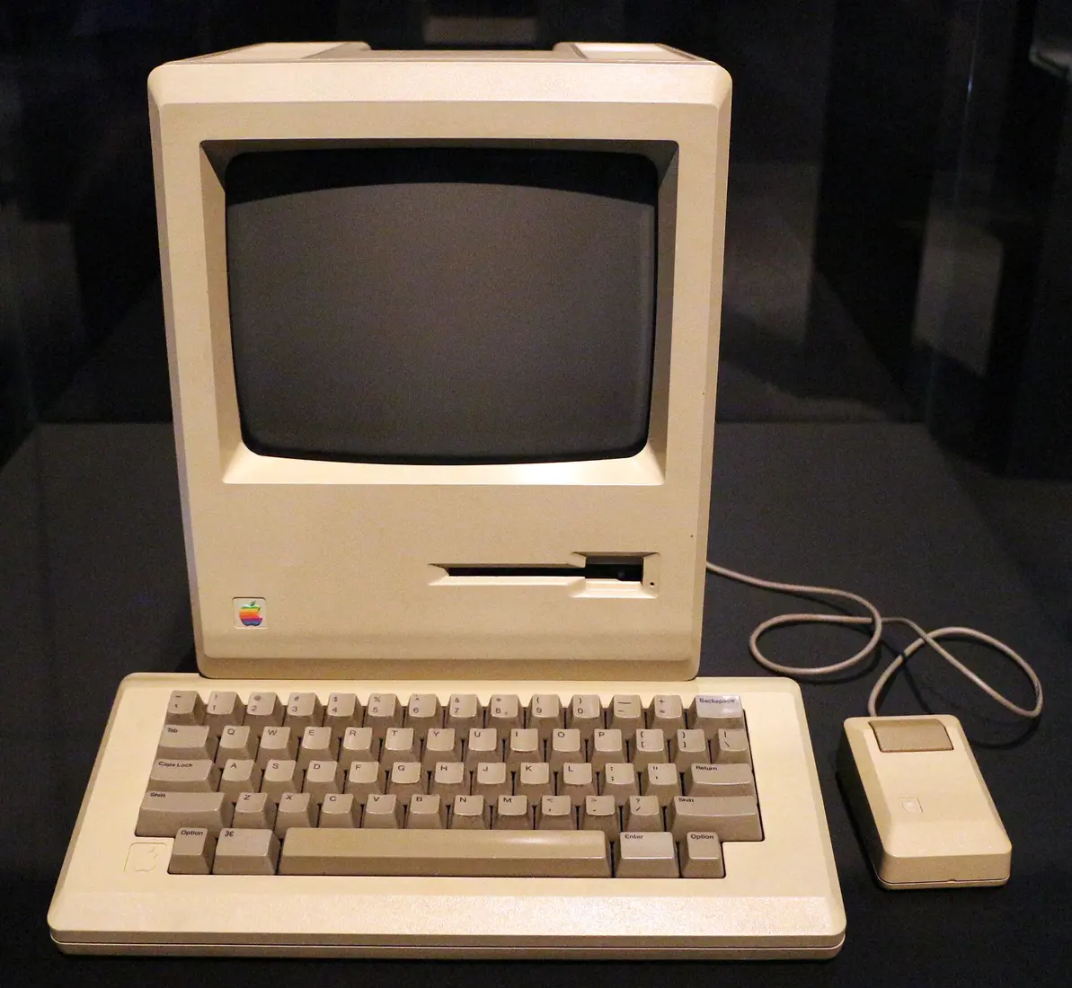
A pixel was on or off: black or white. That made colour pictures impossible, but produced a crisp screen and a manageable bitmap. Designers used patterns of black and white dots to suggest grey. Shadows, hatching and different densities of stipple still gave windows and drawings depth.
The limitation suited the graphical interface. Icons had to remain clear at a tiny size and letters had to stay readable. Susan Kare and other designers made every pixel deliberate. Expression came not from colour but from outline, rhythm and a touch of humour.
09 / More freedom, new tricks
The Amiga moves the boundary
With more colours, hardware sprites, the Blitter and the Copper, the screen became a playground for moving images.
A classic Amiga could display 32 colours selected from a palette of 4,096 in a typical low-resolution mode. Its special HAM mode could display all 4,096 in one image, although the technique brought restrictions and colour fringing of its own. Eight hardware sprites were available, but many games relied mainly on the Blitter to move larger, more colourful objects—often called ‘bobs’—through memory.
The Copper could alter video registers while the screen was being built. Colour gradients, different display modes stacked vertically and other raster effects became possible without forcing the main processor to do all the work. The old discipline did not disappear. The toolbox grew larger and the tricks became more spectacular.
10 / From necessity to style
The restriction vanished; the pixels remained
Modern hardware can display millions of colours and immense numbers of moving objects. Designers nevertheless continue to choose small palettes, chunky pixels and animations made from only a few frames.
- 1977Atari VCS
The image emerges line by line, timed precisely for the television.
- 1982ZX Spectrum
Two colours per 8 × 8 cell turn colour clash into a signature.
- 1982Commodore 64
Sprites and a balanced palette bring arcade-like fluency.
- 1983MSX
A shared video standard brings sprites to computers from many brands.
- 1984Macintosh
Black and white with high sharpness makes every icon matter.
- 1985Amiga
Custom chips open the door to colour, video and fluid animation.
Pixel art is now a choice, not a sentence. Good pixel art still follows the same lessons: a clear silhouette, a restricted palette, readable movement and no dot without a purpose.
The machines of the 1980s taught artists to work not despite their limitations, but with them. That is why we no longer see only deficiencies in their imperfect pictures. We see a language.
11 / Sources & images
Explore further
- Sinclair ZX Spectrum BASIC Programming — colour and attributes
- Commodore 64 Programmer’s Reference Guide — Programming Graphics
- MSX Technical Data Book — display modes and sprites
- Atari Stella Programmer’s Guide, revision A
- Amiga Hardware Reference Manual, third edition
- Centre for Computing History — Macintosh 128K
Image credits
- Pixel illustrations and technical diagrams — original work for Silicon & Joysticks
- Commodore 64 — Evan-Amos, public domain
- Philips VG-8020 — SanderK, public domain
- Atari VCS / 2600 — Evan-Amos, public domain
- Macintosh 128K — Sailko, CC BY 3.0


